Website Navigation – the 10 cardinal rules

First things first, what exactly is the definition of website navigation?

There are actually 2 aspects to this, the first is having a menu and the 2nd is how usable the menu is.

The menu enables visitors to go directly to specific known parts of a website.

Almost every good website has at least one menu and ideally a search feature for finding information if the menu feature is not intuitive enough for the visitor to find what they want.

Remember we are all individual and unique in our own ways, what seems obvious to one person may be an enigma to another.

Having the search feature is a fall back or contingency option that might keep someone on your site log enough to find what they were looking for, ideally it shouldn’t be needed but for large complex websites with lots of pages and subjects it is actually pretty much unavoidable from a practical viewpoint.

The 2nd aspect of usability is in other words how easy the menu is to figure out and be put to use.

Typically figuring out how to use a menu needs to take seconds rather than minutes and most people visiting a website would not spend more than perhaps 20 to 30 seconds trying to figure out a menu before they are off back to Google and looking for what they might consider to be a better site on the same subject that has a menu they understand immediately.

If you use tools such as Google analytics you can see this affect through the bounce rate, i.e. how many people leave your site almost immediately after landing on it, the other reason for leaving is of course that they don’t think it has the information they were looking for, but that is another subject.

So here are the 10 rules

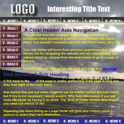
Functionality – the menu must not get in the way of the websites function, people usually come to a website either to get information or to buy something and normally they want to do that as quickly as possible then leave again as soon as they are done. The menu must not get in the way of that, ideally it should be barely noticeable that the menu is being used, it really should be that easy, if people are having to stop and think about where to go next then the navigation is not functioning optimally.

Identifiable – the menu must be very easy to identify and must stand out from the content of the website, think about how many times you have visited a website and could not tell the menu system from the actual content of the website. The result being that you click a couple of times on what you think are links and nothing happens. You don’t do that too often before you are off and looking for a different site.

Readable – very much common sense but I think we have all come across websites where readability has given way to artistic license, a really fancy font or very subtle colour differentiation that ulitmatley results in illegibility. So text and graphics must contrast sufficiently with their backgrounds to be readable and chosen fonts must be clear and large enough to see. The equation of resolution versus load times must also be carefully balanced, a high resolution may provide images that are very sharp but if set too high it can cause the website to load too slowly, back off a little on resolution and the difference will probably be barely discernible, if at all, but the page will load much more quickly and keep the visitor interested.

Scan ability – the menu items must jump out from the background and be obvious, this is because it is a matter of fact that people scan when they look at website pages they do not read to great levels of detail. For that reason and reasons already mentioned the menu items need to be short, succinct and clear as to their function. For example a button that says ‘Home’ will clearly convey it’s message, whereas a block that says ‘to go to the home or index page of this website you need to click here’ is not what you could consider a scan able link. A ridiculous example but does make the point.

Operable – the normal general user interface for a website is to use a mouse which controls some sort of pointing device. The target for this pointing device firstly needs to be large enough and secondly sufficiently spaced out from other links to ensure that the visitor can select the link of choice with ease and does not end up in the situation of having difficulty selecting their chosen link or even worse selecting the wrong link.

Expected behavior – this refers to following known standards, without getting too technical there really is no such thing as intuition but there definitely is familiarity, just think of windows based menus on their standard software packages. In other words when people are familiar with functions, it means they have already learned how to use them. So if you follow known standards for presenting navigation systems you are half way to the system being usable by people already familiar with those methods of navigation. This does not mean you can’t be inventive or come with new and interesting ways of doing things, but you need to be sure that the new ways are easy to learn and provide enough of a wow factor to make them worthwhile.

Load speeds – not just pages but also menus need to load very quickly, for some reason people using the internet tend to start to get frustrated as quickly as a couple of seconds and actually start to think their PC has locked up if they have to wait longer than about 8 seconds. Little tricks like saying the page is loading may help a little but ultimately if the navigation system does not load quickly enough then your visitor will again be heading for the back button or Google search page.


Usability versus branding – make sure that usability takes precedence over branding, if the corporate colours, graphics and logos cause a website to become un-navigable then it is the branding that must compromise. The sweetest images in the world will not keep a visitor on the site if they cannot get to the information or product they want.

Handicap accessibility – blind or visually impaired people may not be able to see your menu system and may have to use an electronic braille reader or voice system to navigate your site. These types of system rely on plain text or alternative addresses to interpret menus so you need to make sure that those tools are employed as standard on your websites.

Multiple Browsers be aware that not everything you do will necessarily work on every browser, so you need to check your designs on a range of browsers and ensure that they work to an acceptable standard on at the very least the most popular browsers being used.

These rules are important and it is possible to follow them without compromising artistic intent which is another very important factor of website design. If you can keep to these rules while at the same time wowing your visitors with artistically stimulating presentation then you will have achieved the ultimate combination for getting and retaining visitors on your website, providing of course you meet the prerequisite of having useful and or interesting information on the site in the first place.

Posted in navigation, website design | 2 Comments

Finding a Domain Name

The ideal domain name will communicate the nature of your business in a clear and succinct manner that is easy to remember.

It is a good idea to avoid unnecessary hyphens and words that are tricky to spell or are convoluted in nature.

You will need to be reasonably imaginative in coming up with the desired name because most generic words such as holidays.com or onlineshopping.com will have been snapped up years ago and simply will not be available to you.

In fact virtually all the 3 and 4 letter word combinations have already gone.

If you can afford to and it is important to you from a business perspective it would be a good idea to register your selected name (and potentially misspellings) in all the available top level domains. The following list displays some of the currently available options: –

.tel
.com
.co.uk
.org.uk
.me.uk
.uk.com
.uk.net
.eu
.net
.org
.info
.biz
.name
.mobi

The clear favorite for most people registering a domain is the ever popular .combut as can be seen above that is by no means your only choice these days and you may even find that one of the other options is a more suitable alternative.

For more information on domain names and how they are used you can visit the Nominet website. Be sure to have a look at the terms and conditions when you are on the site and visit the FAQ’s list which is very good for providing the information you need.

Nominet UK is the registry for .uk registered Internet names where all UK unique domain names are registered using a numerical address that is mapped to a more memorable name. Different countries have different registries but they all operate in a similar way.

Domain name registration can be likened to a post code i.e. the numerical address is a part of the full address and is used to point to the server where the website is located.

The numerical part of the address is not visible to the website visitor but when a URL (uniform resource locator) is entered into the address line of a browser, the numerical address associated with that URL is used to locate the server where the website resides i.e. the Domain Name System (DNS) translates easy to recall names (domain names) such as http://french-holidays-aude.com into a numerical address and that address points to the server where the website resides.

It is the domain names that are used in advertising, are placed on business cards or listed by search engines in order to help people find them on the Internet. From a search engine perspective if the domain name is something that is likely to be included in a search query (keyword or keyword phrase) then the chances of the website being listed first in the results are increased.

The choice of a domain name depends on a lot of factors , it could be an existing brand name, a completely new brand starting from scratch, a company trading name, a trademark or perhaps a generic service being provided. But whatever is selected must be unique and they are issued on a first come first served basis. You can use hyphens, numbers or underscores to make the name unique but generally if you can avoid these options that is considered better although I have to say if it works for you, you like it and people will remember it then I don’t see a problem.

The best way to find a name is probably just by sitting down and brainstorming a list of about 20 names for yourself which ideally would be no more than 7 characters long. This will be more difficult than you think but is a worthwhile exercise.

To search for a domain name, check it’s availability and cost you can go to 123-reg.co.uk

123-reg is an Internet service provider (ISP) and they will act as your agent to submit a domain name to one of the national registry’s on your behalf.

When you do this you will be entering into two separate binding contracts firstly with the national registry and secondly with the ISP who acts as your agent. Make sure you understand your rights and obligations with respect to the contract with the ISP particularly in the event of a breakdown in commercial dealings with the ISP.

This may sound a bit daunting but it is the safest way to ensure that the name is registered in your name and that no one else can take it from you for instance if the name became really valuable for some reason.

One other thing you should be aware of is that you do not own the domain name and if you do not renew the contract with the registry the name can be made available for other potential applicants, normally after 2 years. So make sure you do not let the contract expire.

A further alternative for both domain registration and hosting is Hostazar which has come highly recommended to me and will appeal more to the American market as it is a US company.

Posted in domain names, website design | 3 Comments

Internet Explorer, Don’t You Just Love It

I had a horrible problem on a website I have been working on with a very simple popup menu. The problem only actually occurred in IE7 (didn’t check earlier versions) but worked fine in:

  • Mozilla Firefox
  • Google Chrome
  • Netscape
  • Opera
  • Safari

I posted around various forums but didn’t get any answers to my questions or suggestions on how to fix the problem.

I thought it would be something really simple that someone would say to me just tweak the code here and it will be fine, nah life isn’t that easy.

There were some posts on using CSS driven menus or buying 3rd party software and I have to admit I did consider that for a while as I was spending so much time trying to get this fixed.

The Problem

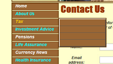
You can see from the images that I would get the menu minus the text when it first triggered, if I moved the cursor slightly up or down then the text would appear or if I just put the cursor into the popup menu box. So it wasn’t a major problem but was very irritating.

To add to the problem sometimes the top box (income) didn’t display text when the other 3 were displaying, but sometimes it did, so was very intermittent in nature making it difficult to determine if it was fixed or not with the various changes I was making to try and resolve the issue.

Also when it didn’t display the only way to get the text was to put the cursor into the very top box of the popup menu, but then it would disappear again when you moved to the main menu or one of the other popup options. Not really satisfactory and proving to be a bit of an issue.

So here comes the solution

I found a suggestion to someone else’s question in one of the forums to use a DHTML menu which also had a link to an online tutorial here at Dreamweaver DHTML Menu – Tutorial.

I had a look through and it didn’t seem too complicated plus I really do like simple solutions, so I decided to give it a go. The tutorial doesn’t give you all the answers because, well every website design has it’s own requirements, but it did provide me with enough of the basic approach to enable me to work out my own solution.

The principle behind it is that you use the hide/show behaviors option in Dreamweaver to select elements that either show or hide your menu. The menu itself is placed in it’s own layer and is hidden until you hit the show trigger.

Then you create some hide triggers so that when you move off the menu it gets hidden again and that is basically it.

You can create a submenu layer and then nest divs inside that to configure your menu and control it all with CSS for size, colour, borders etc.

You also need to create a small transparent .gif file which you can size and use for the hide triggers again creating a layer for these to sit in (I used the same layer for all (3) of the hide triggers) which you can then position where you want them and sized to suit your needs. I used Photoshop to create the .gif, really easy.

It took me a little while to work out the details but it wasn’t really that long before I had a working solution.

One little note however, I created 4 separate divs for my popup menu and because of the effect I was looking for I left slight gaps in between them so I could see the background colour. This proved to be a problem with, you’ve guessed it, IE7. What happened was there was just enough of a gap to trigger the hide area which was sitting behind the menu, this resulted in the menu going to hide before I could select my required link. It was a little confusing because Mozilla didn’t seem to mind the gaps and worked fine.

Anyway the solution was to close the gaps and use CSS to put a border on the edges that looked like background, I got the effect I wanted with no gaps and IE7 then worked fine.

So if you want a nice simple popup menu that works with not too much overhead in terms of code and with the added advantage that the search engines can follow/spider these links (which they can’t through javascript) I would suggest that you take a look at the tutorial and give it a go.

If you want any help from me then just leave me a comment or drop me a line and I will be happy to help where I can.

Also bear in mind that I only needed one popup menu so this was a fairly simple design, may need a bit more thought for multiple popup menus but I am pretty sure it can be done with a little perseverance.


This is what the final version looked like, apparent gaps and everything, but the best of all is that it works in all the browsers listed, including IE7 – fantastic.

Posted in website design | 1 Comment

Reviews of French Holidays Aude Wesbsite

Reviews

“I really enjoyed the photos of the lovely country side. It would be so cool to take a boat ride in the Canal. The site was a pleasure to visit. Every thing looks great.”

Bobbie
bjsuniqueproducts.com

“Not only a good site but also very informative as well. I like it very much. “

Serge
catalystentrepreneur.com

“What a fab site, will tell as many people about your holiday retreat. Making you a favourite. Well done. good luck for 2009”

Julie
villapasatiempo.com

“Nice pictures, fast loading and easy to navigate. I’d like to visit, is the impression you left me with, and I think that is what you want.. “

Luka
cipatravel.com/

“Nice, pleasing site with soft pastel colors. Looks like a gorgeous place to visit!”

Caribbean
tropicalreservations-cr.com

“This is such a beautiful site with lot´s of useful information and the pictures are quite lovely. I am glad to see it not full of google advertsing. Thank you!”

Kimberly
bybloshotelcostarica.com

“Your site has all the information anyone could need about vacationing in Le Moulin area of France. I wish I could afford to vacation there. Your site makes it look so beautiful. Keep up the good work.”

Bob
moreinternetincome.com


“Looks idyllic, and well worth the price. Gallery showing local attractions is good. Professional site design and neat layout. Site loads fast and very easy to navigate.”

michelle
sunandskibulgaria.com

Get your own reviews, free traffic at

This website was developed to advertise a gite (self catering accommodation) in the South of France for French Holidays Aude. If you would like to develop a similar site or a site to meet your own requirements then please don’t hesitate to get in touch to discuss.

Posted in website design, Website Reviews | 2 Comments

First Basics of Website Design – The Specification

So what can be so hard about specifying a website design, put some text together, throw in a few graphics stick them on an html page and bingo, job done.

Afraid not, there is a little bit more to it than that, especially if you want to get the right look, feel and functionality in an easy to use website that lets your visitors flow through the content to the information they landed on the website to find in the first place.

A few things to consider: –

  • What do you want your website to be e.g would it be just a catalog that you could point people to for example from a high profile advertising site or alternatively a website you would like to be found on the web in it’s own right to promote you and or your business.
  • Who is going to be your target audience and where geographically will you find them.
  • What consideration have you given to your domain name, are you looking to create a brand, do you want the name to be a potential search engine inquiry (keyword based) or simply the name of your business.
  • How do you intend to categorise your website, this is important in determining how many individual pages you will have and the links required for those pages. The easiest way of sorting this out is to produce a site map in a flowchart form. In doing this you not only work out the pages you need but also define how visitors will navigate through the website and interact with it.
  • The contents of your website will very much depend on how you have answered or considered the points above, the text may need to be keyword rich for instance, graphics and dynamic data may need to appeal to a young or old audience and the colours you choose will be extremely important to help you put across the image you are seeking to portray. A good way to get a handle on the look and feel you are trying to achieve is to look at what other people have done with their websites, not that you need to copy those sites you would, I think, want to be original, but you can get an idea of what might work and what definitely does not work for you. It is a good idea to liaise with your designer(s) at this stage and get some ideas sketched out or put into an electronic medium so that everyone involved can get an idea of proposed layouts and style. This is known as a comp or comprehensive artwork and can range from a pencil sketch to something produced in Photoshop or Fireworks, the latter items are generally better for getting an actual web page mock up.
  • Performance may be important to you, possibly all you might want to know is how many visitors a day you are getting or perhaps you would like to know who is referring to your website, what pages they visit most, which pages they leave your wesbite from. There is software available that can give you pretty much any level of sophistication you are looking for but adding it and setting up the reporting is part of the design brief.
  • Then there are the aspects the designer is responsible for, conforming to current standards, making sure the website is consistent across different browsers, loads quickly and is search engine friendly with, invisible to the viewer, header information in place. Something you should be aware of even if it is not strictly part of the public aspect of the design.
  • SEO (search engine optimisation) starts at the name you choose for your website and to be honest never really ends, particularly if you want to be on the first or second page of the search engine results listing. Some of the aspects that need to be considered are covered in my posting on ‘Tips to work from home’ which is actually about working on the internet and getting the most from your websites.

Two of the most common and widely used software programs for website development are Dreamweaver and Photoshop. and these packages are generally considered to be the industry standard, Dreamweaver for developing the website code and Photoshop for the graphics.

For dynamic media the industry standard used is the Macromedia Flash program and it can be used for animations, movie clips, dynamic menu functions and more. An important consideration if you decide to use Flash is whether your visitor computer has Flash installed because if it doesn’t then your Flash based design will not be available, this is less of a problem in recent times as most computers do tend to carry Flash software, a more likely problem is that they are running older versions of Flash and you need to cater for that and don’t assume the latest versions will be available.

The last thing I want to discuss in this post is the selection of a good hosting site, there are many out there some are free (don’t forget you get what you pay for however) but whoever you choose they need to support your website to the required level. I can help you with your selection but at the end of the day the choice will be yours and you decide how much you are prepared to pay and the level of service you need.

Posted in website design | Leave a comment